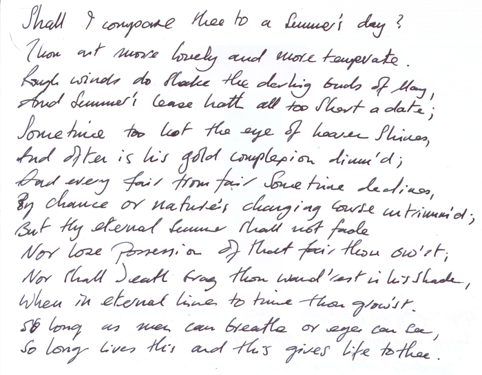
Doctor Vee’s post about handwriting caused me to think about the scrawl that passes as my handwriting. As I pointed out in his comments; I use a fountain pen. Old habits die hard. We are supposed to be able to analyse ourselves by the way we write… Ahem, so, let’s look at the scrawl in question below and see what comes up:

According to this site, we are not supposed to write in straight lines. However, mine are almost exactly straight:
A person who writes a straight line may also go straight toward his daily aim. If a person writes in a precisely straight line we may say that person is unyielding.
Ah. Well… Er, yes, pretty accurate. Oh…
What about the space between words? Well, I don’t think the pauses outweigh the words, so it’s this:
When a person speaks with pauses it may be because they are accustomed to pondering and considering before they act. It may also be because the person wants to let the words sink in to the audiences consciousness.
Yup, that’s true enough, too.
Okay, what about the space between the lines – you know, the place people try to read? On balance, there’s a fair bit of space between the lines, so:
A person who writes with wide space lines may live a life of order and system. These people have executive ability and reasonableness. But if the space between the lines becomes too wide it may indicate a person who likes to keep their distance.
I do like order, I do like to keep my distance and I do like to consider myself a reasonable person – at least, I hope I am. I write with a distinctive right slant:
The right slant is the most common and and most natural slant. The right slant is found in people in a hurry, impatient people and the active writer.
Damn! Found out again… And symmetry? I think, on balance, the upper part of the letters are more pronounced than the lower.
When the upper zones are strongly developed we are dealing with a person of intelligence and ambition.
Naturally.
However their emotional development remains infantile.
Ooops!
What about legibility? my writing is generally a hurried scrawl and frankly, barely legible. However, it isn’t really covered. The closest is this:
Legibility is a measure of the writers sense of purposefulness. Legible handwriters make good teachers and speakers. They are sincere and co-operative.
I guess that will have to do. I am a professional trainer and I am used to speaking in public. And the shape of the letter?
Tall capitals are people who tower above the rest. Tall initials come from impressive people.
Hmmm, possibly… My capitals do tower a bit and the initials tend to stand out.. Maybe… The space between letters indicates that I am:
When only some letters are unconnected it shows an artistic and intuitive thinker.
Artistic and intuitive – of course. I would expect nothing else.
You may however, conclude that I’m not taking this too seriously. You may be right. You may conclude that I’m cherry picking the good bits. You may be right.
Well at least you can do joined up. Mine is so bad that I’ve resorted to the keyboard. Still, when I do write (as opposed to two-finger type) the crayon keeps on breaking…
I can’t read it. Whether that’s due to the multiple pints of cider I’ve had of an evening, I do not know.
That must be it…